
Product, Identity Design, Illustration
Akigora
Background
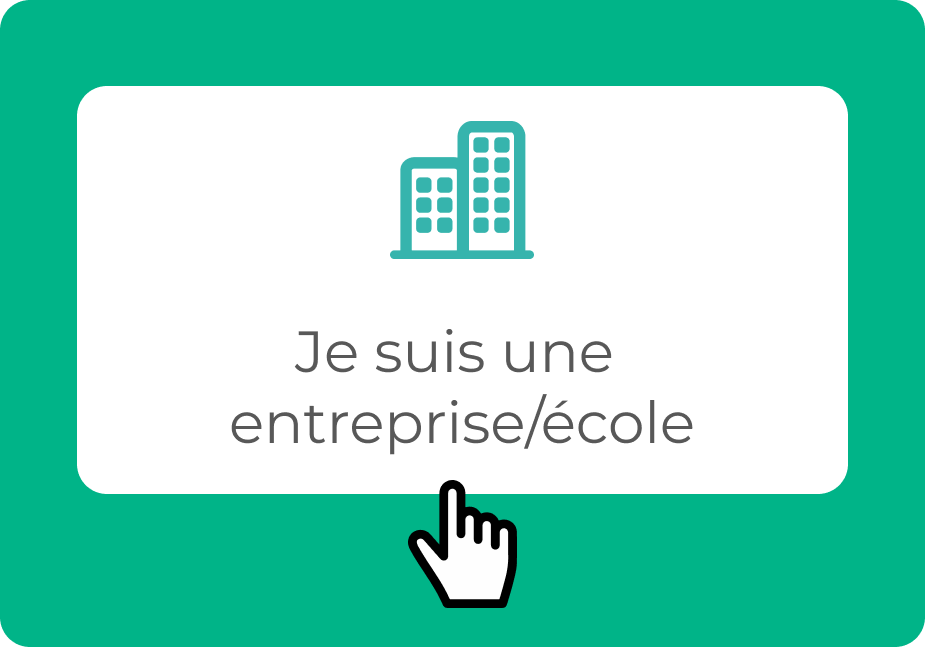
Based in Bordeaux, Akigora carefully selects freelance professionals with over a decade of experience and puts them in contact with companies and educational institutions who seek their expertise.
Project type: Desktop website redesign
Scope: Identity, UX/UI and illustration
Duration: Six weeks
Tools: Figma, Adobe Illustrator, Photoshop
Year: 2023
The challenge
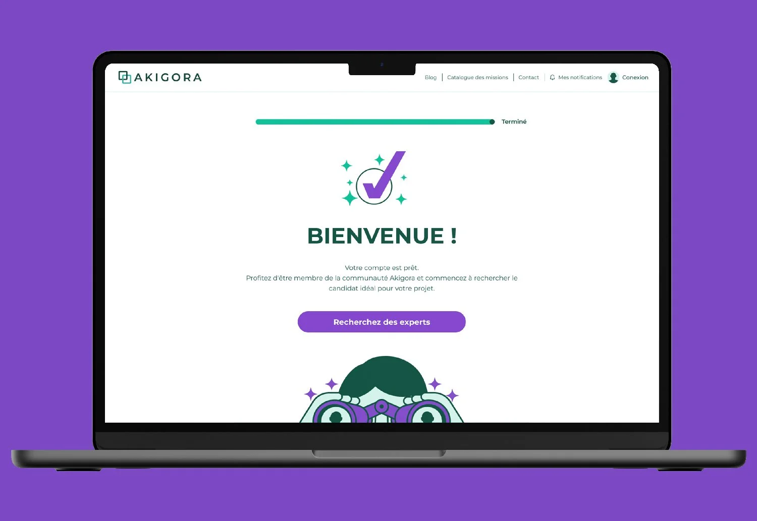
I was tasked with identifying user pain points in the existing recruiter registration user flow and presenting solutions via an interactive prototype.
1. Empathize
A. Secondary Research
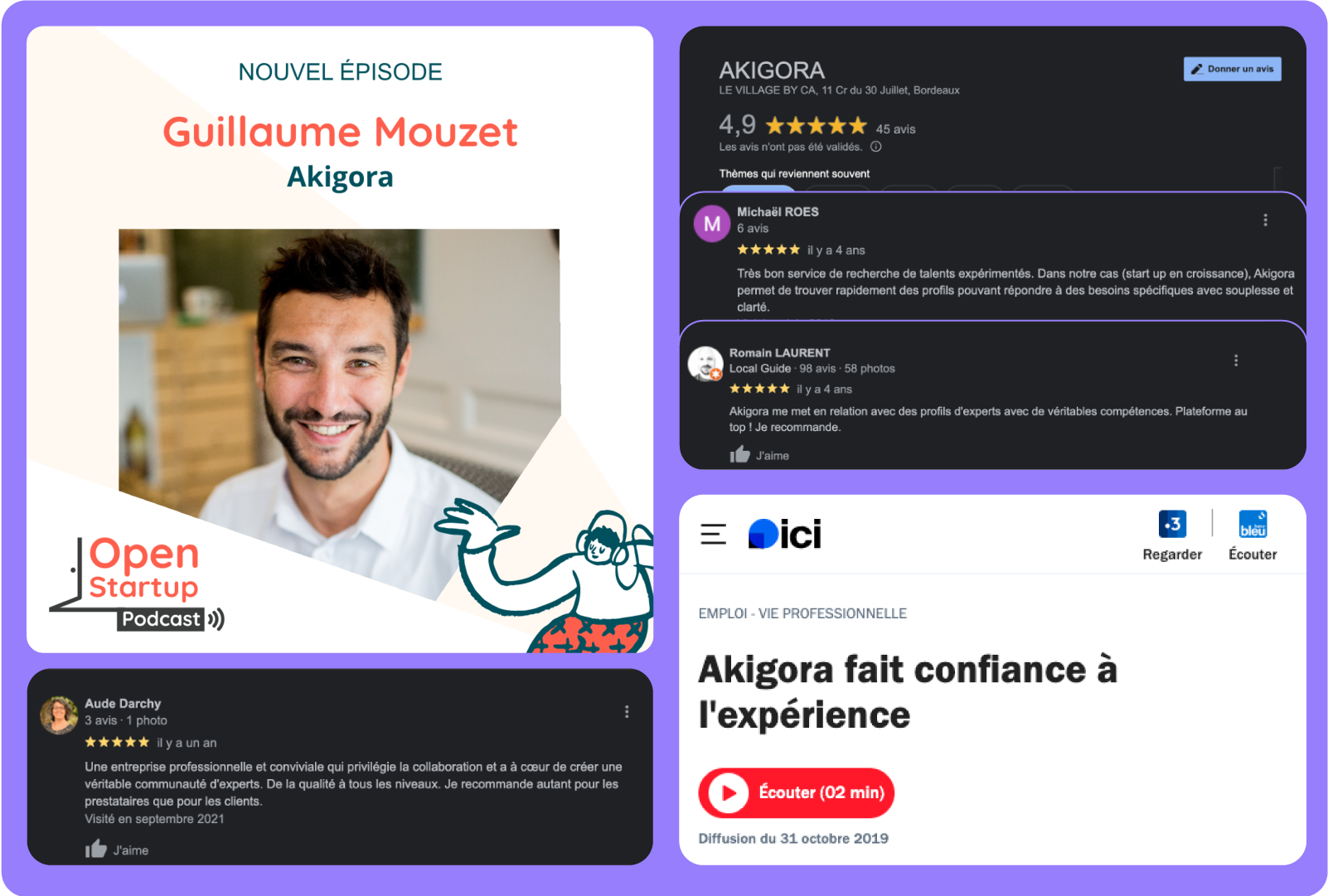
I conducted secondary research on Akigora's industry, market, and user behavior. This included reading articles, analyzing Google Reviews, and listening to a 1-hour interview with founder Guillaume Mouzet.
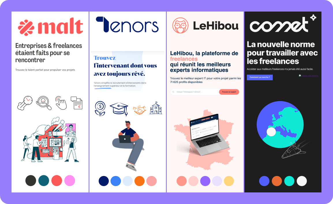
B. Competitive Benchmark
I assessed Akigora’s competition to understand strengths, weaknesses, and opportunities for a better user experience.
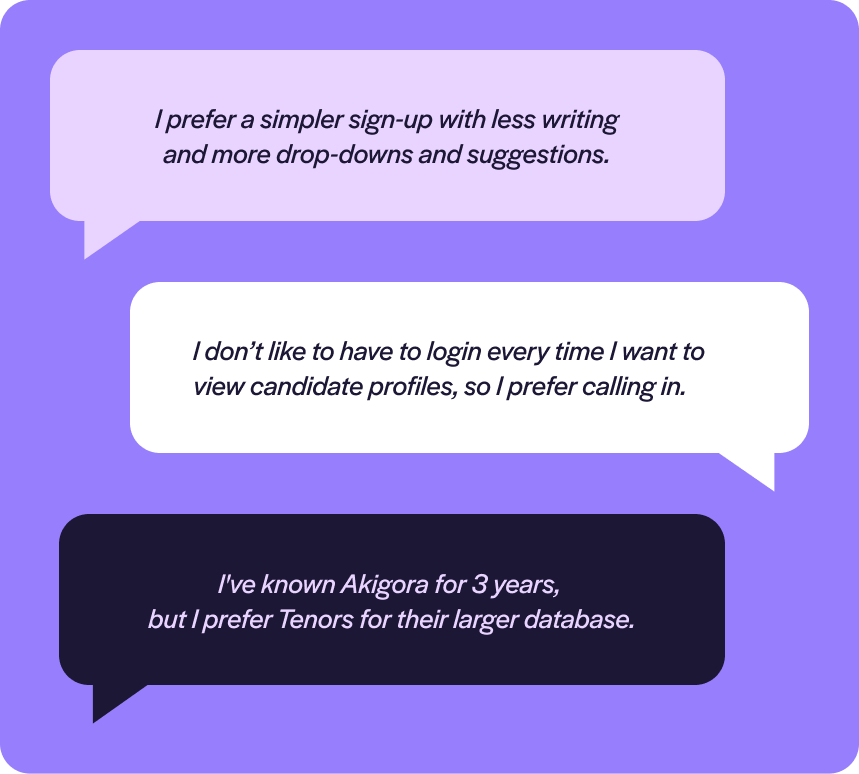
C. User Interviews
I conducted one-on-one interviews with Akigora users to understand their platform usage, likes, dislikes, and challenges. Here's what they said:
2. Define
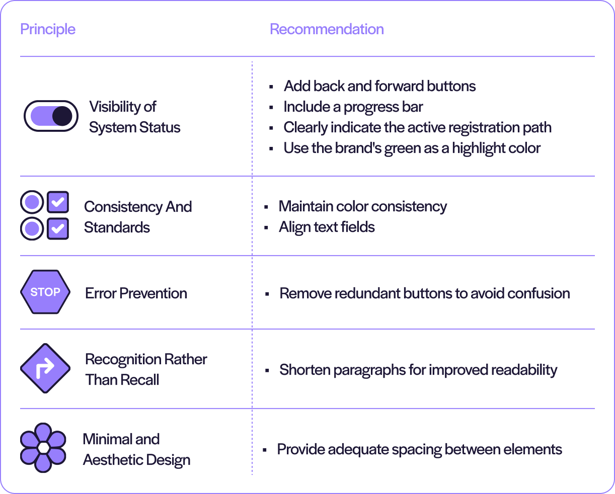
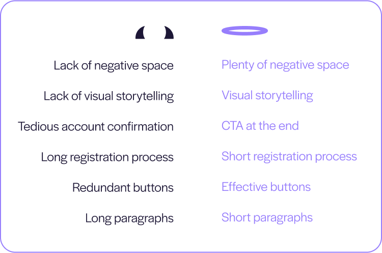
A. Heuristics Analysis
I found some things that could make signing up easier for recruiters thanks to a heuristics analysis of the user flow.
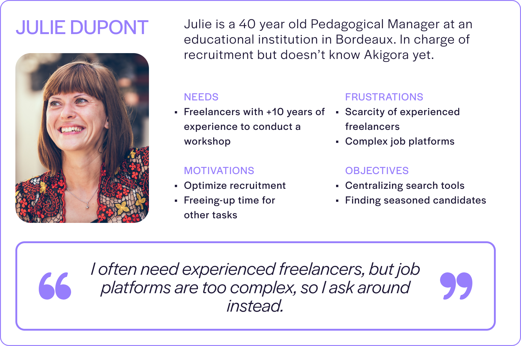
B. User Persona
From what I found in my research, I put together a user persona to inform the design phase.
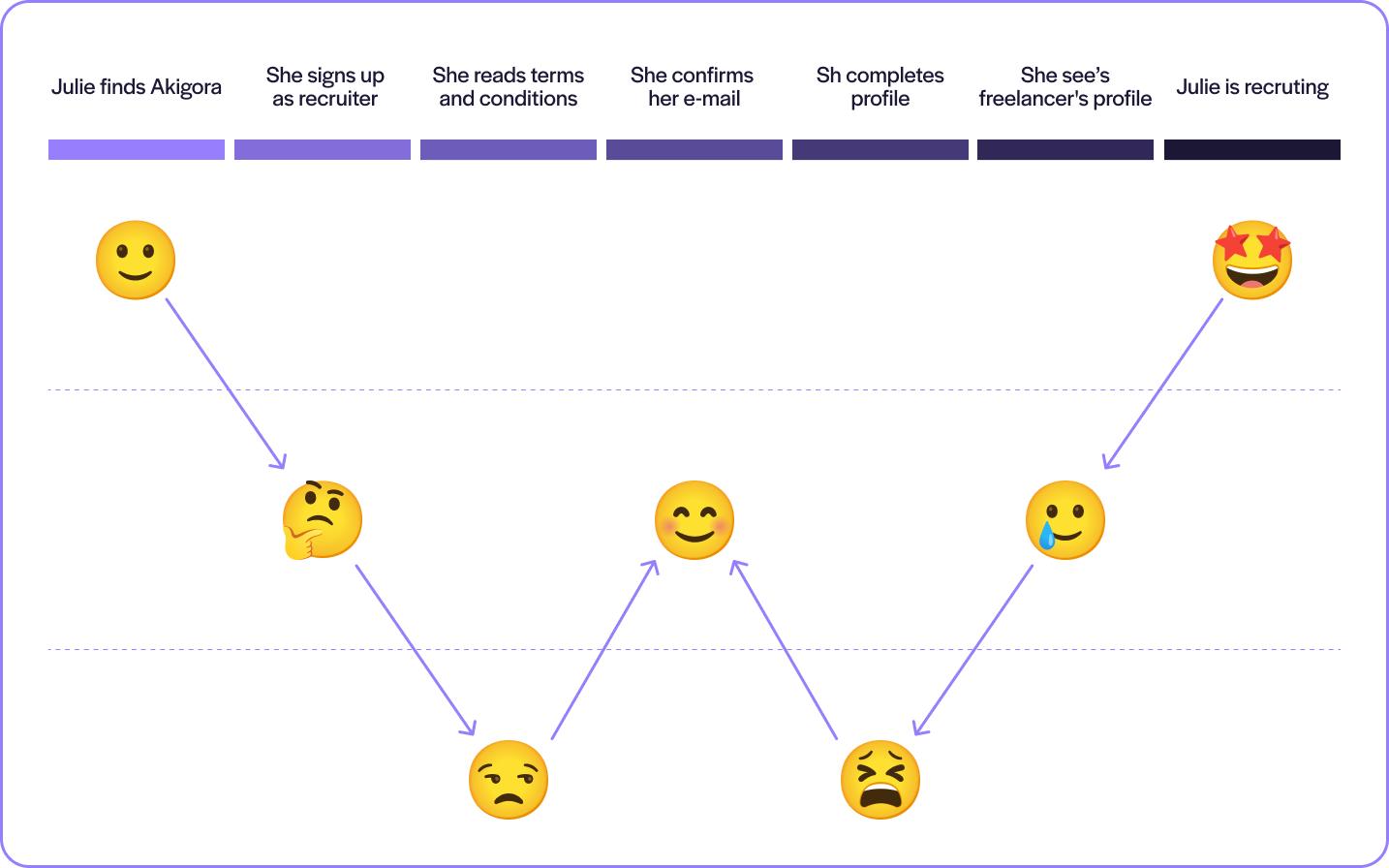
C. User Journey
A visualization outlining Julie’s interactions with Akigora, from initial encounter to task completion.
D. Problem Statement
“Recruiters searching senior freelancers are deterred by complex sign-up processes. They need a simpler way to search them”
3. Ideate
A. Worst Idea
First, I did a "worst idea" exercise, which sparks innovation by kicking things off with the most counterintuitive design ideas.
C. Crazy 8’s
A visualization outlining Julie’s interactions with Akigora, from initial encounter to task completion.
4. Prototype
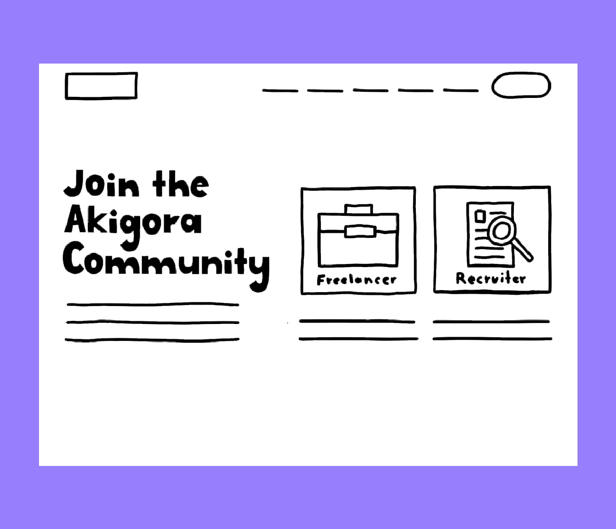
A. Low-fidelity prototype
I just sketched out the notions that resulted from the ideation phase into a hand-drawn wireframe.
B. Medium-fidelity prototype
I made a mid-fidelity prototype to make the design feel more real, still prioritizing functionality over perfection.
C. Usability Testing
I evaluated the efficiency of the prototype to identify problems and gather feedback by observing 3 separate users interact with it in real time.

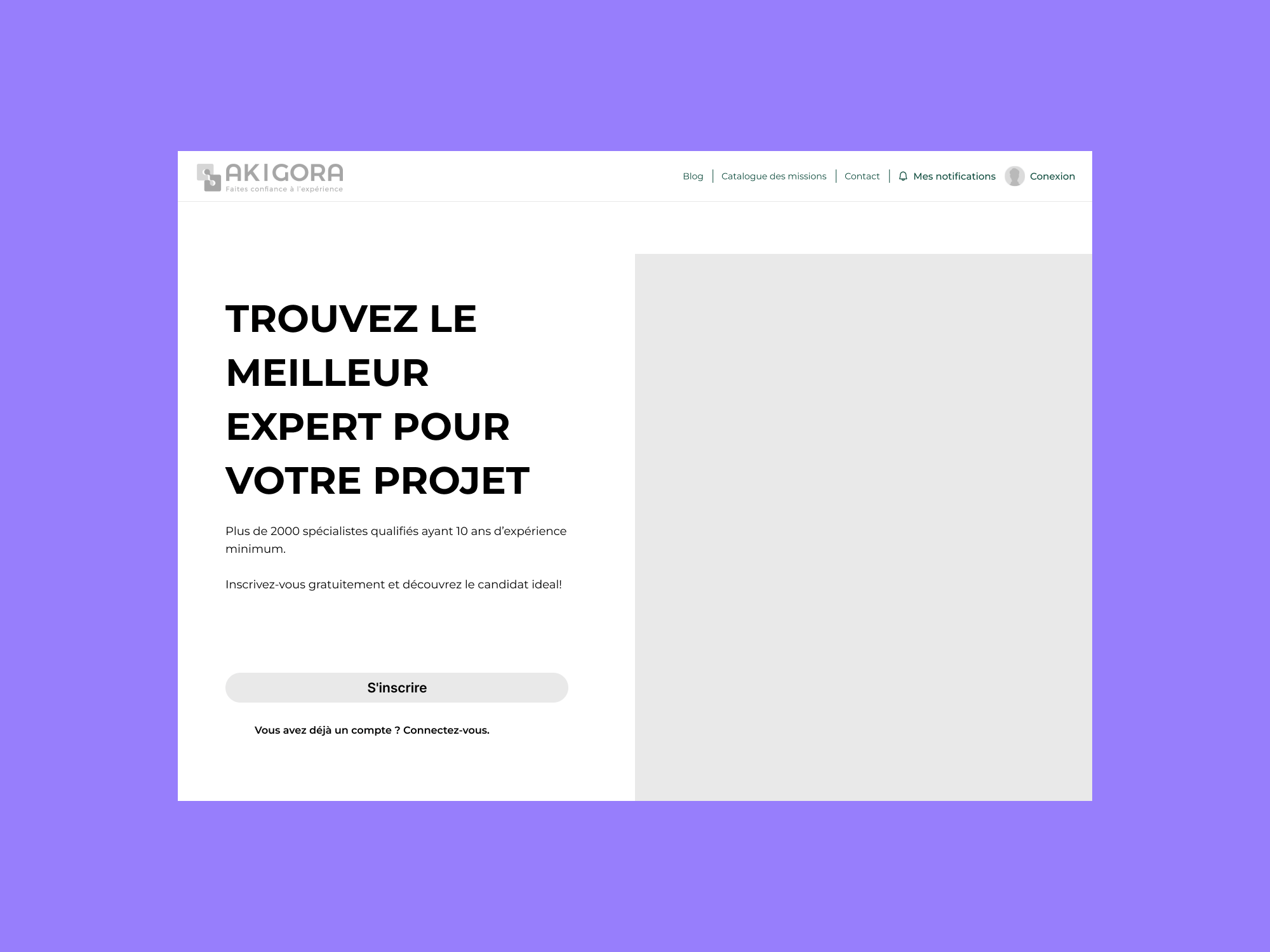
D. High-fidelity prototype
I made a mid-fidelity prototype to make the design feel more real, still prioritizing functionality over perfection.
Key Learnings
• A